Tuesday, October 7, 2008

Classifications

It’s been a while since I’ve talked about image classification, but ultimately, it’s the main issue that must be tackled in the scope of this project. The entire Landsat archive is soon to be available online for free. In the mean time, I’ve done a couple of test on some data I already have at hand.

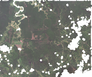
I’ve chosen a subset of a circa 2000 Landsat 7 tile. I chose this tile because it has little cloud cover and it displays a few land use classes (water, forest, converted land [fields, small cultivated parcels, buildings,…].)

Landsat subset in natural colors
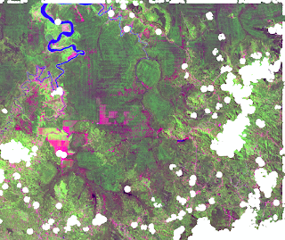
with a mask over clouded areas

Pseudo color composite of the same subset

At first glance, we can discern water, forest, vast fields and heterogeneous areas with small cultivated parcels, buildings and patches of trees.

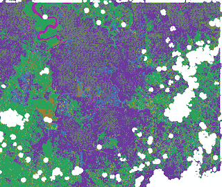
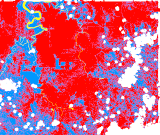
I did two unsupervised classifications where I asked the classifier to classify my image in 15 classes and to only consider areas of more than 25 contiguous pixels.

Maximum likelihood classification
performed by GRASS

Unsupervised classification by Feature Analyst

My intuition is that the unsupervised classification of Feature Analyst is far less cluttered that the one performed by GASS’ maximum likelihood classifier. Also, it seems that Feature Analyst managed to put more pixels in the prominent classes where as GRASS created numerous classes for any single prominent class as identified by Feature Analyst.

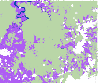
Now for the supervised classifications. I used the same training map for all my supervised classifications. I created three classes for my classification: one is water, an other forest and the last one is converted land (fields, small parcels, buildings…)

Training map for supervised classification

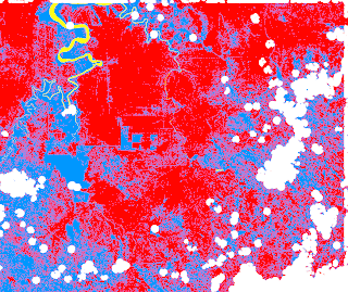
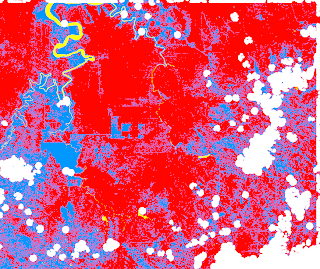
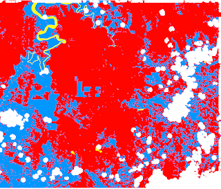
I did three types of classification with GRASS. I did a maximum likelihood classification based on the signatures of my training sites. I did a second maximum likelihood classification, but with signatures generated with a clustering algorithm that uses my training sites as input. Finally, I did a contextual image classification that uses sequential maximum a posteriori (SMAP) estimation.

Maximum likelihood classification

Maximum likelihood classification
with clustering algorithm

SMAP classification

All three classifications gave similar results, but ultimately the SMAP classification seems to give me the best results.

I also used Feature Analyst, with the same training map, to do a supervised classification.

Feature Analyst supervised classification

The results are uncluttered and impressive. I can only assume that by tweaking the classification options of Feature Analyst and by adding a few classes, I can further improve the results.

This said, I wondered if I could slightly refine the smap classification by doing a little aggregation of astray pixels. Here's what I get:

Refined SMAP classification

In the end, both the SMAP classification and the Feature Analyst classification are somewhat comparable. This leaves me guessing... what is the approach to adopt? I guess further testing is in order.
Thursday, September 4, 2008

Elevation

Here are a couple of elevation images for Borneo. No specialized software is required in order to view them. (Files are only accessible when the light is green)

The light is RED

Low resolution DEM
Full resolution DEM

50m isoline map
50m isoline map (brown & green)
10m isoline map

I've created them with data from the Shuttle Radar Topography Mission.
The raw data can be downloaded here.

Tuesday, September 2, 2008

Clouds some more & principal components analysis

It’s not that I particularly like to ramble on and on about the same things, but this is going to be, in part at least, yet another post about clouds. I don’t want to repeat my self too much, but some of the nice datasets we have come from the Landsat missions. Unfortunately, these images are plagued with an abundance of clouds. Nevertheless, their hi resolution (both spatial and spectral) still make those Landsat dataset valuable assets. I’ve started to experiment with how these clouds, and their shadows, can be masked. I found a methodology online that I’ve tried on a Landsat tile from 2000 and it seems very conclusive. I basically used the same technique as Martinuzzi, Sebastián; Gould, William A.; Ramos González, Olga M. used in order to mask clouds in their publication Creating cloud-free Landsat ETM+ data sets in tropical landscapes: cloud and cloud-shadow removal.

The main steps are as follows:
  • Create two masks over potentially cloudy pixels. Pixels with values above 120 in the first band and pixels with values between 102 and 128 in the band 6.1 are considered as such.
  • Create a 3 pixel buffer around those mask to take into account pixels that are only partly cloudy
  • The intersection of those two should cover all the clouds.
  • Now to deal with the shadows, we need to relocate that mask over the shadows. This is done by finding a cloud with peculiar features over low land (where clouds are usually the further away from the ground) and measuring the offset of the shadows in relation to their respective clouds.
  • To take into account the influence of the topography, add a 10 pixel buffer to this relocated mask.
  • Now a mask with potential cloud shadows is created by considering all the pixels in band 4 with values between 17 and 66.
  • A 3 pixel buffer must be added. The shadows identified this way also include shadows of buildings and topography, so we’ll need to create a mask that is the intersection of this mask and the offseted cloud mask we previously created.
  • I added a 6 pixel buffer to that mask.
  • So now we have a mask for clouds and one for their shadows. By joining them both, we get our final cloud and cloud shadow mask.

Here is what it looks like:

Landsat 2000 color composite without the mask

And now with the mask applied

So the clouds and their shadows are fully covered, but my methodology still needs tweaking. Indeed, this final mask covers way more ground than needed. The threshold for obscured pixels must be adjusted. The size of my buffers must be fine-tuned. Maybe the translation offset as well. Also, my results would be more precise if I resampled the band 6.1 so that the pixel size matches that of the other bands. Furthermore, prior to all the previously described steps, it would be useful to do an atmospheric correction of the datasets.

Ideally, if we’re able to get our hands on additional Landsat snapshots, we could create composite images of our own that are a lot less affected by clouds.

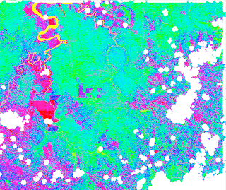
With my new mask at hand, I proceeded to do a principal component analysis of a Landsat 2000 tile. Without the mask, the statistical abundance of clouds and shadows in my image would undermine the principal component analysis. Here’s what it looks like:

Color composite of the three principal
components of a Landsat 2000 image

As you can see, the types of fields and vegetation is very differentiated…

Wednesday, July 30, 2008

Ah those clouds...

At first glance, it seems the LANDSAT data is the most usable set of information to generate land use maps. Both the 1990 set and the 2000 set cover the whole island. There are a lot of spectral bands to generate signatures from, the 28.5m resolution seems more than adequate for our purpose and there is more than enough literature to prove that LANDSAT data can be used to produce land use maps. Unfortunately, as was mentioned in the previous post, Borneo is plagued with clouds. So we set out on a quest to diversify our datasets. This ongoing quest has taken us all over the web and I made a table to summarize our findings. There is quite a bit of usable stuff out there, but only trials and testing’s will reveal the true value of it. One promising purveyor of such data is the MODIS project. They make a whole bunch of datasets available for free online. Their data is acquired by two satellites, Aqua and Terra. Together, they manage to image the entire earth every one to two days. They publish data numerous times every year for a period spanning from the year 2000 to the present. The datasets produced are not very affected by cloud cover because they are composites of a stack of images taken over several days. For each pixel on the final image, only the “best” pixels are taken into account. The downside with the MODIS data is that the resolution is much coarser than for the LANDSAT data. Some of the higher resolution datasets they produce have a 250m resolution. One interesting dataset is the MODIS/Terra Vegetation Indices 16-Day L3 Global 250m SIN Grid V005. Some of the promising layers are the EVI, the NDVI, and the visible and infrareds bands. At 250m, the resolution might be coarse. On the other hand, I generated an NDVI from the 2000 LANDSAT images and they really seem to show differentiation between the cultivated areas, the forested land and the clearcut areas. My hope is that decent results can be achieved with the MODIS data.

NDVI generated from the 2000 LANDSAT data

NDVI from MODIS/Terra Vegetation Indices 16-Day L3 Global 250m SIN Grid V005
for the same area

Another promising dataset is MODIS/Terra Vegetation Cover Conversion 96-Day L3 Global 250m SIN Grid. Each dataset highlights the areas where change has occurred over the past year in the tree cover. I’m tempted to use several images (there is one dataset produced every three months) to create an animation showing change through time that reflects the transformation of the forest.


Having talked with Jeff and Rodolphe today, we’re starting to envision the big picture of what is going to be produced from all this. It’s still early to have anything close to a perspective on the final product, but having a coarse estimation of what’s going on with the Borneo forests is definitely a priority. After that, if we can refine some areas of interest, or areas where we have better data, it’s even better. On an other note, using the DEM to figure out (or at least confirm the general assumption) that people are willing to plant palms in more remote areas over time is something that would be worth doing.

Wednesday, July 2, 2008

Pelleter des nuages

An important issue to be tackled concerning the mapping of Borneo is what to do with the clouds. Borneo is largely covered by rainforest so there are quite a lot of them obstructing the view. So what can be done? I’ll just free style a couple of options here (not all of them are feasible or practical.) Ideally, it would be great to erase all of them. This said, because some of these clouds are quite thick, I’m doubtful even a sophisticated ATCOR algorithm would see through them. Also, I don’t believe it would be relevant to use such an elaborate algorithm here. For one thing, we don’t have information available to use ATCOR reliably. This said, we still need to take into account the atmospheric interference. A more basic approach, using a SMAC like algorithm for instance, would be more suited (ex.: Production of CORINE2000 Land cover data using calibrated LANDSAT 7 ETM satellite image mosaics and digital maps in Finland .) Another way of getting rid of clouds is by comparing multiple images pixel by pixel and keeping the “best” ones. The challenge then becomes finding numerous images of the same areas, ideally taken over a relatively short time frame. In the end, we might have to completely give up on certain areas and concentrate on what we can work with.

On another somewhat related note, I’ve found a new source of data where we have all the bands of the LANDSAT images. Also, the metadata provided enables us to know when each image was taken so we can better take into account both the angle of the satellite and of the sun, something which will turn out quite useful to enhance our images, especially in conjunction with the DEM.

Friday, June 13, 2008

First classification tests

The last few days of work have mostly been dedicated to finding, retrieving and organizing data. We now have a digital elevation model of the entire island:


I’ve also started doing some classification tests on the 1990 LANDSAT data. I’d like to use the 2000 data, but there are still some issues to be resolved with converting our files to a usable format. Here are some examples of what we get. I believe it’s optimistic:

Original image

Unsupervised classification
Supervised classification

Friday, May 23, 2008

Second meeting with everyone

For the coming weeks, the team is going to be scattered around the globe, so today, while everyone is still in town, we held our second meeting. We started the meeting by looking at some satellite images and aerial photographs of Borneo. I had pre-identified a couple of interesting sites, namely some plantations on flat land, recognisable by the orthogonal patterns of the cultivated parcels, and some on hilly terrains where roads and parcel boundaries follow contour lines. While scoping out the images in a flat area, we identified some forested areas adjacent to a palm oil plantation and it seems that the structure of the new plantation follows the pattern of old logging roads. It might have been a tree plantation, partially logged then converted to a palm oil plantation.

New patterns emerging from the old ones?

We also identified areas where traditional slash and burn is practised. In those areas, the parcels in fallow take on a different shade than the more mature adjacent forest. We can also see small cultivated parcels. In those areas, the presence of roads is worrying. Are those solely used by the locals or are they also used/built by logging companies attracted by an easily reachable loot…

There were some mysterious patterns in the south-eastern part of the island. Comparing the LANDSAT images from 1990 and 2000 really makes them stand out. Obviously, something happened in between those years. Large scale fires is one possibility that was brought up. Failed rice plantations is another.

1990

2000 Here patterns emerge that weren’t there ten years before

Further west of there, other strange patterns stood out. They show up both on the 1990 and 2000 LANDSAT images.

1990

2000 The patterns are still there

A closer inspection of one of these redish spots on a hi-res photo that is even newer than the LANDSAT 2000 images reveals that it is actually almost barren land. In over ten years, those cleared areas never regenerated themselves. Although it would be hasty to jump to conclusion, those areas might be clear examples of what happens when the topsoil is washed away by heavy rains following a clear cut…

Recent close up on a barren patch

After checking out our area of study from above, Stéphane brought out a bunch of spatial data concerning Borneo, and especially the Sarawak region. There was an abundance of data. I don’t know if all of it will be very useful, but some of it might be especially of interest, namely a bunch of land use maps at 1:25000 scales that span from 1988 to 2003.

Rodolphe and Stéphane are both going to be in Asia for a good part of the summer and they’re both going to spend some time in Malaysia. While they’re there, they’ll get to interact with some potential collaborator to our project and they’ll be able to get information and usable data at the source. We made sure to discuss some means to share data while everyone is on their own and to coordinate our schedules for future meetings. The possibility of Stéphane, carrying a GPS while he’s abroad was also brought up. He’ll be the one spending the most time in Malaysia and he’ll be visiting areas directly affected by palm oil production. We think it will be a good way for him and the rest of the team to identify some interesting sites and to put them in a broader spatial context.

To everyone taking off in the coming days, I wish you luck on your travels.

Wednesday, May 14, 2008

First look at LANDSAT data

Today Jeff and I had a first look at the LANDSAT data provided to us by Stéphane. That data consists of two sets of images, one from 1990 taken by the LANDSAT 4 and 5 satellites and one from 2000 taken by LANDSAT 7. There are some images missing from the 1990 set. I would say, glancing quickly at the mosaic of images, that +/- 5% of the area of the island is missing. There are three bands in the images. We don’t have extensive descriptions of the files we’ve been given, but we’re guessing that the bands are green, red and near infrared. The pixel size is 28.5m * 28.5m. It is coarse, but we can recognize shapes. For instance, we can see roads and barren land is easily identifiable. As far as vegetation is concerned, we can see shapes of different shades of green. Therefore, we should be able to do a classification to map the plantations and the forest. However, it is bound to be challenging as there are factors that will complicate the task at hand. For instance, the land that is to be mapped is hilly and that creates shadows. The area of the island is quite large and the altitude of the terrain varies. The broad range of climatic conditions will translate in different types of vegetation with their own spectral signatures. Furthermore, the different growth stages of various oil palm plantations will mean that different plantations don’t show up the same way on the images.

The classification will require the identification of valid training sites. To figure out which sites may be used, we are going to have to make use of various resources. For instance, we plan on using hi resolution areal photographs publicly available online (through Google Earth, Virtual Earth, World Wind…) where we can easily identify plantations. Today, we looked at was available through Google Earth. Unfortunately, hi resolution aerial photographs where only available for a very small fraction of the island of Borneo, emphasizing the need to find other sources of information to find training sites. One of those might be the concessions for palm oil plantation maps from the WWF.

Since a picture is worth a tousand words... :

Here is forest (on the left) and a palm plantation (on the right), identified with a hi resolution photo from Google Earth:


If we zoom in a little, we can see the distinct pattern of the palm plantations contrasting with the forest:


And this is what the area looks like on the LANDSAT images from 2000 that Stéphane gave us:


As can be seen, the difference between forest and plantation is obvious to the human eye, let's hope our classification software feels the same way...

Tuesday, May 13, 2008

May 7 2008 - kickoff

Attending: Rodolphe De Koninck, Stéphane Bernard, Alexis Dorais, and Jeff Cardille.

At this meeting, we talked about the big picture of our research together over the next few years, and made a few specific plans for Alexis, who will be starting on the project early this summer.

Our driving question can be phrased like this:  Is there systematic clearance of land that is being replaced by oil palm?  Is oil palm replacing (a) primary forest; (b) secondary forest (c) barren lands; or (d) other crops?  

Our immediate questions focused on the remote sensing work that will be led by Alexis beginning this summer. In particular, we asked ourselves about the potential ability of the Landsat data to show the important types of land uses in Borneo. Among these were Oil Palm, Rubber, Rice, Timber Plantations, Mixed Agriculture 1 (Rubber in Forests), and Mixed Agriculture 2 (Peat and Mangroves). 

Additionally, there are several questions that  we can/should follow up on in the next few weeks:
1. The full repository of Landsat data will be released for free in the near future. (1) When will this be? (2) Is there likely to be useful data, or will we be limited by the spatial resolution? (3) are there smart algorithms for merging a large number of landsat scenes through time for a land use classification? (3) Can an object-oriented classifier be of use here? What program should we use for the classification? (4) should we create a public database of this work?

Jeff noted a few small items to remember for the future:
1. We might look at the concessions for oil palm listed in the WWF document, and contrast that with Google Earth data.
2. Where will we find ground-truthing info?  This may be google earth or some other strategy. 
3. We might find high-resolution data (through Virtual Earth, world Wind, for example). 
4. Should we create a web mapping server of our data?  


To do:
  • S: readings to Alexis
  • A: shop for computer, 
  • start a web site (maybe through Google for easy collaboration?), 
  • read introductory material, 
  • Begin working with Landsat data provided by Stephane. 

Our next meeting together is May 21 at 14h00, in Jeff's lab.